This post is 948 words long, which should take you approximately three minutes to read.

Are We Defining Long-Form Content Incorrectly?
I have talked about “long-form content” quite a bit lately (including on a Blab-cast about same on AGBeat recently), as I observe many platforms fighting for (more sustained) attention. But are these platforms, like Medium, LinkedIn Pulse, and Facebook Notes, really “long-form?” Is defining the form versus Tweets and standard Facebook status updates enough to declare them “long?” Perhaps it’s a semantic debate, but I fear going much farther down the road of declaring 1,000-word treatises (or even blog posts like this) “long-form” when they take less time to consume than an episode of “Modern Family.”
I began thinking of that when Bryan Person reminded me of a podcast that I had heard much of in the past but never made the time for (cue ironic laughter), the “Longform Podcast;” more to to the point, Longform.org links to articles more in the spirit (or length, at least) of a site like the late, lamented Grantland, with the purpose of putting more thought and art behind prose, rather than, well, posts like this one.
How are we defining long-form content? This post from Wordstream acknowledges disagreement but finally settles on articles of 1,200 words or longer. If we are to agree with the national average reading speed of 300 words per minute, (I scored 365 on my try, for what it’s worth), then “long-form” applies to an article one can read in 4 minutes.
Medium helpfully estimates the time it would take to read the articles hosted on their site, and in my visits articles tend to be marked as “3-5 minutes.” Is this long-form? Medium, by its very name, does not claim that, but that seems to be how we define long form. One post did some digging into data and found the optimum post to be 7 minutes (which I will take from my link above to mean 2,100 words on average). “Long?” The Bealtes’ “Hey Jude” is longer.
I am trying to take more care in the future over what “long-form” really means and defining it appropriately. I hope it makes me a tiresome pedant. When I’m done here, I’m off to read a book.
How Dare Twitter Try to Make its Timeline Useful!
UPDATE (2/10): Twitter was planning something after all- let the funeral procession begin!
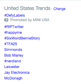
Twitter’s latest tinkering is not a cool-looking feature that nobody I know uses– and that I like but never use; it’s not tinkering with its executive team, though I suppose that continues. No, Twitter has dared to announce that it wants to tweak the algorithm so that the main timeline follows an algorithm rather than a strict chronology. This has led to the #RIPTwitter trending hashtag (I wonder how Twitter feels about that feature as I write this):

As someone who follows far too many people, I find the main Twitter feed to be unreadable, so welcome this change if it improves things. I can understand how people who are better at curating their Twitter follows might worry about the change in their carefully cultivated experience, but also wonder if the changes to their feeds will be all that significant, due to the smaller sample from which the algorithm to choose. But then I again I don’t know how it works, or how this one will work.
There is a more in-depth (though not “long-form”) discussion of this announcement by my Stone Temple Consulting colleague, Mark Traphagen, on our company’s blog. He agrees with the “wait and see, it might be a good thing” take.
Beware of Tweets Bearing Gifs.
Meanwhile, another potential feature may be rolling out. I may have made my peace with gifs some time ago, but I’m not entirely sure. Either way, Twitter is testing gif support for iOS (iOS= “beta test guinea pigs, when it’s ready we’ll roll it out to the cool users on Android).

Facebook Friends Day
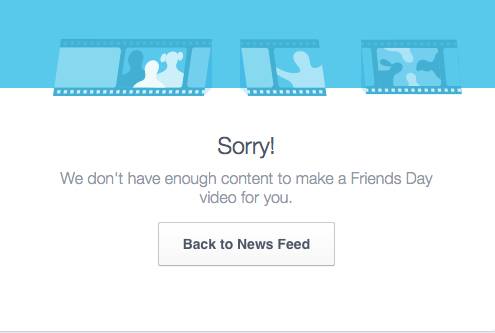
Facebook declared Thursday, February 4 “Friends Day” (Wouldn’t Wednesday have made for a nice rhyme? Opportunity wasted!), creating custom videos for users.

h/t Nathan Gilliatt, though I cannot confirm this was his result.
Get Your Pitchforks and Torches Out, Somebody Redesigned Their Logo
Oh no, Uber redesigned their logo, and people hate it. I don’t know if it’s good or not, I don’t really care too much. But it seems every time a brand changes its logo without a pressing reason, the angry mobs come out. Lesson? Don’t mess with your logo.
As some people point out, they could put more energy into improving the product. No, “I think the founders are jerks” is not what I’m talking about, but perhaps dealing with labor issues could be a start (not that they aren’t trying).
Also, there’s more to the logo change than design: the company is differentiating its logo for riders, drivers and even different locations. That aspect is interesting and practical, no matter what you think of the design.

Sometimes, changing a logo can be an attempt to distract people from the company’s putrid product. Right, Toronto Maple Leafs fans?
Also, in honor of the Chinese New Year starting February 8, a number of friends pointed out to me an interesting design choice for a “Year of the Monkey” poster. Oops. Feel free to click through to the link, I decided that the image can be interpreted as obscenity that I won’t display on the blog. If you look closely, I suppose you can see a monkey and not a graphic depiction of sex. Maybe. (I initially had a link to the designer’s page, but as I write this the entire web site seems to be down.)
To me “long form” is anything that has an in-depth flow of thought to it, that takes me on a chain of reasoning with supporting examples or proofs.
I therefore formally protest your designation of my #RIPTwitter article as not “long form.” ;-)
But I only gave it a 30-second scan!