
In my constant kvetching about how infographics are serving to annoy rather than inform us, a friend (Michael Pace) hipped me to this infographic:
View more presentations from Terence Kawaja
It appeared in this piece on Business Insider, which suggested that social media is way too complicated due to all the ever-changing tools and services.
Why do I love this infographic? It’s a scary, unreadable mess! Because it’s hilarious. It lampoons the idea of too much information, and its clutter and general unreadable-ness (a word?) is actually a commentary on the “social is complicated” point. It also fits on a slide or Web page, so people can actually see the whole thing at once (can more people do that please? Thanks).
As Joe Chernov of Eloqua points out, social media isn’t “ludicrously complicated,” business is. Well maybe business isn’t so hard if you are doing it properly, but that’s worthy of debate, and I’ll just hone in on the first part of that statement.
Joe also pointed out to me that the makers of the infographic didn’t mean it as a hilarious parody of the too-many tools out there. That’s truly disappointing, so I’m just going to pretend that it is, because as satire it’s perfect.
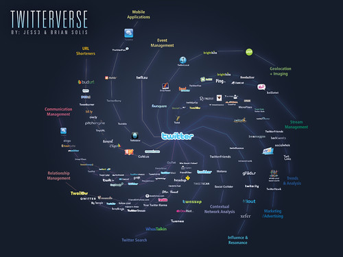
Of course, the original Twitterverse graphic from a few years ago served the same purpose, intentional or not, as a “don’t read it all you’ll get a migraine, plus the point is there is too much to pay attention to all of it anyway and that’s the point” message.
[…] recent post praising an infographic that was actually pretty wrong-headed (but would have made a great parody) has a sequel. Rather than try to prove how complicated social […]
[…] I love this Infographic for All the Wrong Reasons (Doug Haslam) […]